The Company
ACS Technologies is a church management and social engagement software company. ACST software is used by more than 50,000 churches and nonprofits around the world. ACST software enables organizations to manage finances, communication, events, and other areas.
The Product
The City is a group-based social network app available on desktop, iOS, and Android. The City enables churches to create their own private network where people can communicate, collaborate, and grow their ministry. Churchgoers can create a profile, join groups, and post various types of content.
My Role
I worked at ACST from October 2013 to October 2015 as a UX / UI Designer. I took the initiative of kicking the new First-time User Experience or "1UX" project off. I led the design from ideation, requirements gathering, to visual design specs.
The Goal
The City lacked an effective first-time user experience (1UX). A good 1UX would ensure users get off on the right foot; it would help them understand how to use the app and demonstrate the app’s value. A good 1UX would reduce support calls, save money, and create a sense of delight for users.
I would begin with mobile (iOS and Android) in light of the 'mobile first' approach to design and development.
The Challenges
- I would need to convince my team that a new 1UX was necessary.
- Design at ACST was challenging in general because little UX research was incorporated into the design process.
- I would have to adapt the new 1UX to an existing app. Great 1UX should be baked into the design from the start, but a complete redesign would be out of scope.
The Design Process
I began by researching 1UX best practices. I read numerous articles and examined reviews on UserOnBoard.com. I jotted down some ideas and questions in Evernote.
In lieu of UX research, I met with our training team to learn about what users are saying during the signup process. The training team has the most experience working with users, and I felt they were an under-valued asset to the UX process. I learned about problems users were having and talked about potential solutions.
My product owner and I came up with some basic questions users might ask during their first use of The City.
- What is The City? How is relevant to me?
- How do I get signed up?
- How do I use it?
I sketched some wireframes and other doodles to help answer those questions. From there, I distilled 1UX into three components.
- Education - an image carousel to briefly explain The City and its chief utility
- Account Creation - user creates an account and a profile, and requests invitation to join The City
- Coachmarks - in-app instructions to explain how to use the app in context
This was somewhat of a passion project for me, and I experimented with many ideas, UIs, and some visual design. I wanted to design a solid 1UX while developing my visual design skills.
I presented a set of wireframes to the training team and received enthusiastic feedback. The team was excited partly because they were not accustomed to being included in the UX process. I believe UX is a team sport where every team member can contribute to the user experience. My job is to lead the design process.
Designs - Education
My initial set of wireframes were gray and white to help my team (and myself) focus on concepts, not the visual design. My team gave feedback on constraints as far as how the 1UX had to mesh with the current onboarding process. They also gave me thoughts on users' terminology and culture. The team generally approved of the concepts and UI direction for account creation, shown below.
Designs - Account Creation
I included appropriate UI controls (e.g. number keypad for phone number) and signup best practices (e.g. show password by default). One challenge in the signup process was users could not jump into the app after creating an account. They had to wait for approval from an admin. I took this as an opportunity to inject some levity ("Show me the Kittens").
Visual Designs - Education
Visual design was one my professional goals for the year, and I dabbled on the side throughout the 1UX project. These designs were ultimately left on the cutting room floor, but they were helpful in generating excitement from my teams and motivating me to keep learning.
Designs - Coachmarks
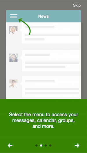
Coachmarks are textual overlays that explain an app's functionality. They are minimalist by design. Most users prefer to explore an app immediately. Hence coachmarks must be brief and contextual if they are to be effective.
My initial designs for Coachmarks were just text and arrows overlaid on the app's interface.
The training team thought Coachmarks had the most value, and the developers thought it would require the least amount of effort to implement. So we determined that we would develop Coachmarks and forego the rest of the 1UX design.
I conferred with the training team several times in iterating the design. I wanted to make sure we were answering users' most important (and common) questions and that we were using language appropriately. I took inspiration from Google's Material Design in reworking the visual design, and Coachmarks evolved into more of a carousel-tutorial. The designs were approved and implemented.
Final Designs
Lessons Learned
- 1UX principles and best practices.
- Basic visual design principles.
- Be resourceful. Use teammates' knowledge of users if UX research is not possible.
- "Shoot for the moon" once in a while with design, even if not everything you design is developed. It helps keep you energized and ever curious.


